here is what I’ve made.
Graphic design, mostly.
here is what I’ve made.
Graphic design, mostly.
Nothing groundbreaking. Just things I enjoyed creating or making look better.
Nothing groundbreaking.
Just things I enjoyed creating or making look better.


jhnson.com
A graphic design portfolio for sean johnson
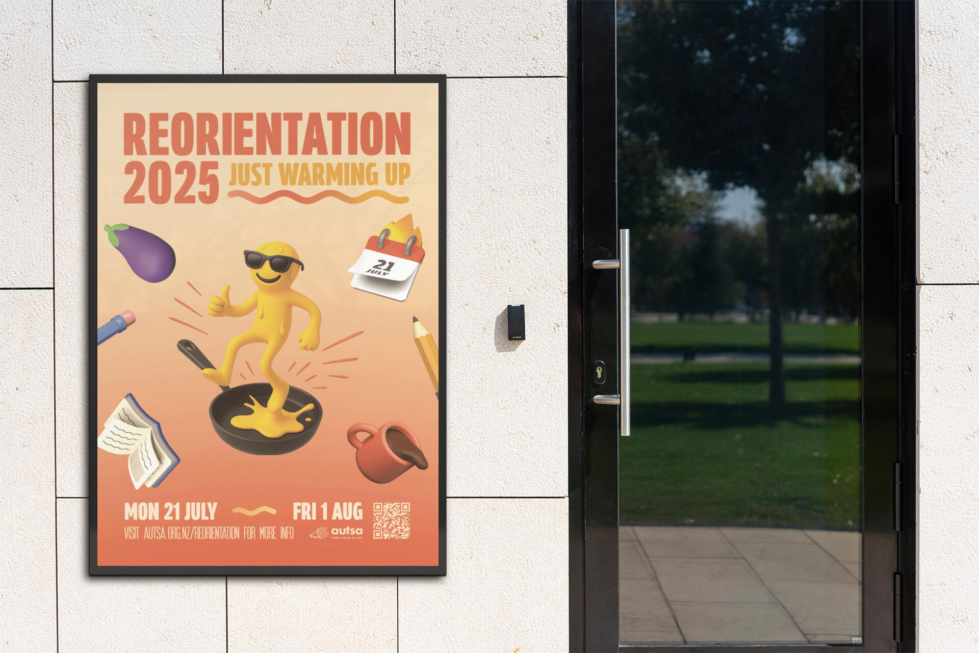
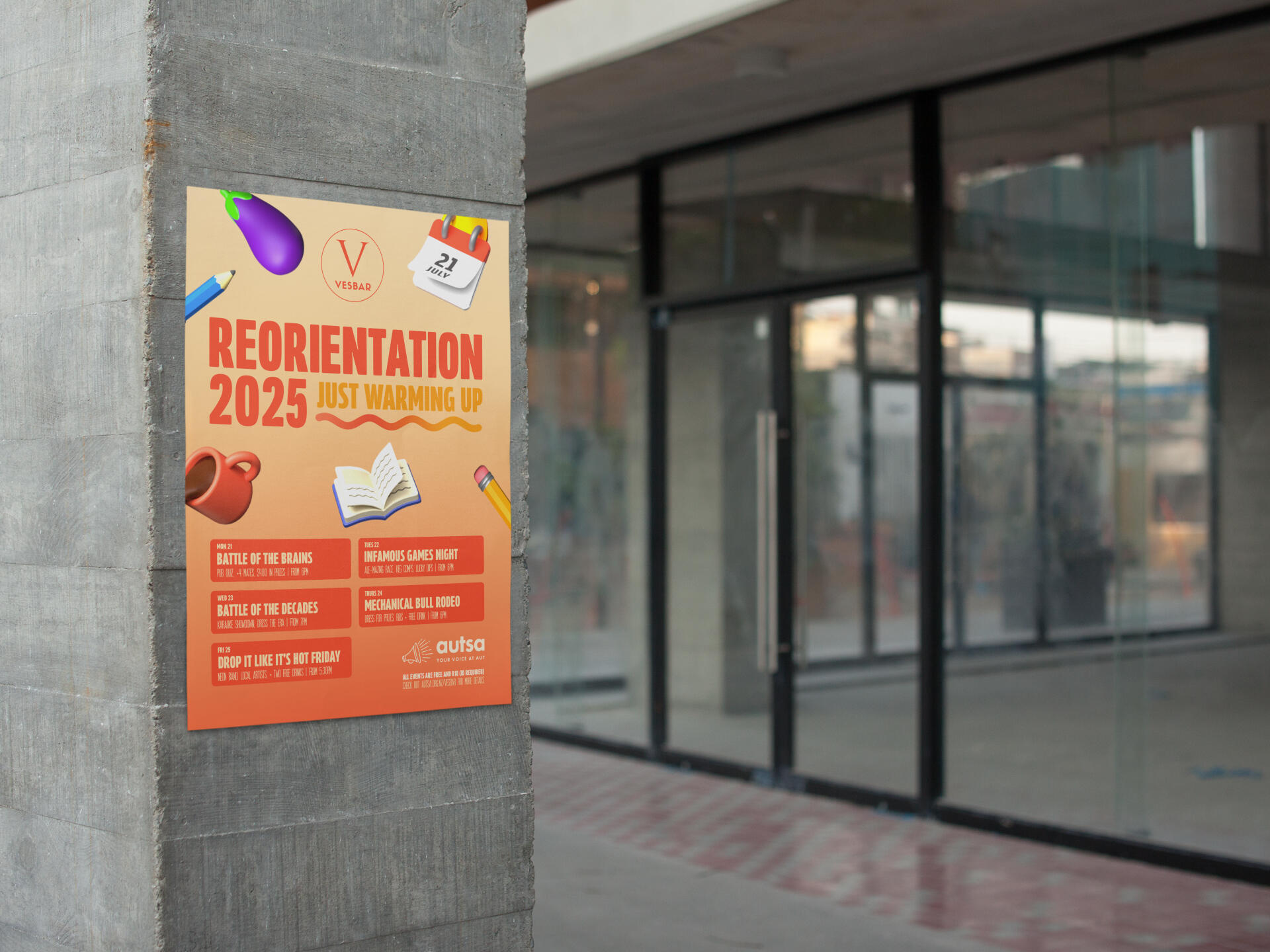
A two-week long reorientation campaign with the theme "Just Warming Up". Half the year's already gone, but the joke is that we're only just getting started. The identity played with 3d emojis, exaggerated warmth, and a sarcastic enthusiasm that students could relate to at this time of year.
Why this project matters
Reorientation week can feel like an awkward in-between of the year compared to Orientation (O-week)., This theme flipped that on it's head, making it loud, ironic, and actually fun to engage with. The whole idea of being "warm" in the middle of winter also gave the campaign a nice contrast: bright, energetic visuals against the grey cold. As well as being an identity ready for collateral like detailed timetables, "Just Warming Up" was about making a semester 2 event that students would actually notice.
What I did about it
I built the branding system and collateral: logo, posters, corflutes, magazine ads, socials, and a timetable design that had to flex across all of them. I leaned into my 3D skills, using blender to create custom models and bringing them over to an interactive website design via Spline 3D. The over-the-top emoji vibe worked as both a joke and a and visual hook, while a simple colour system kept everything consistent.
Why it works
What made this work was the consistency. The interactive 3d website didn't feel like a side project, it matched the posters, socials, and corflutes, so the whole thing felt like one system. Students got to play with the models online and then see the same language plastered around campus.That connection payed off: the website and campaign marketing drew over 14,000 page views compared to just over 5,000 the month before. Nearly triple the attention, all from a simple, but effective visual system.

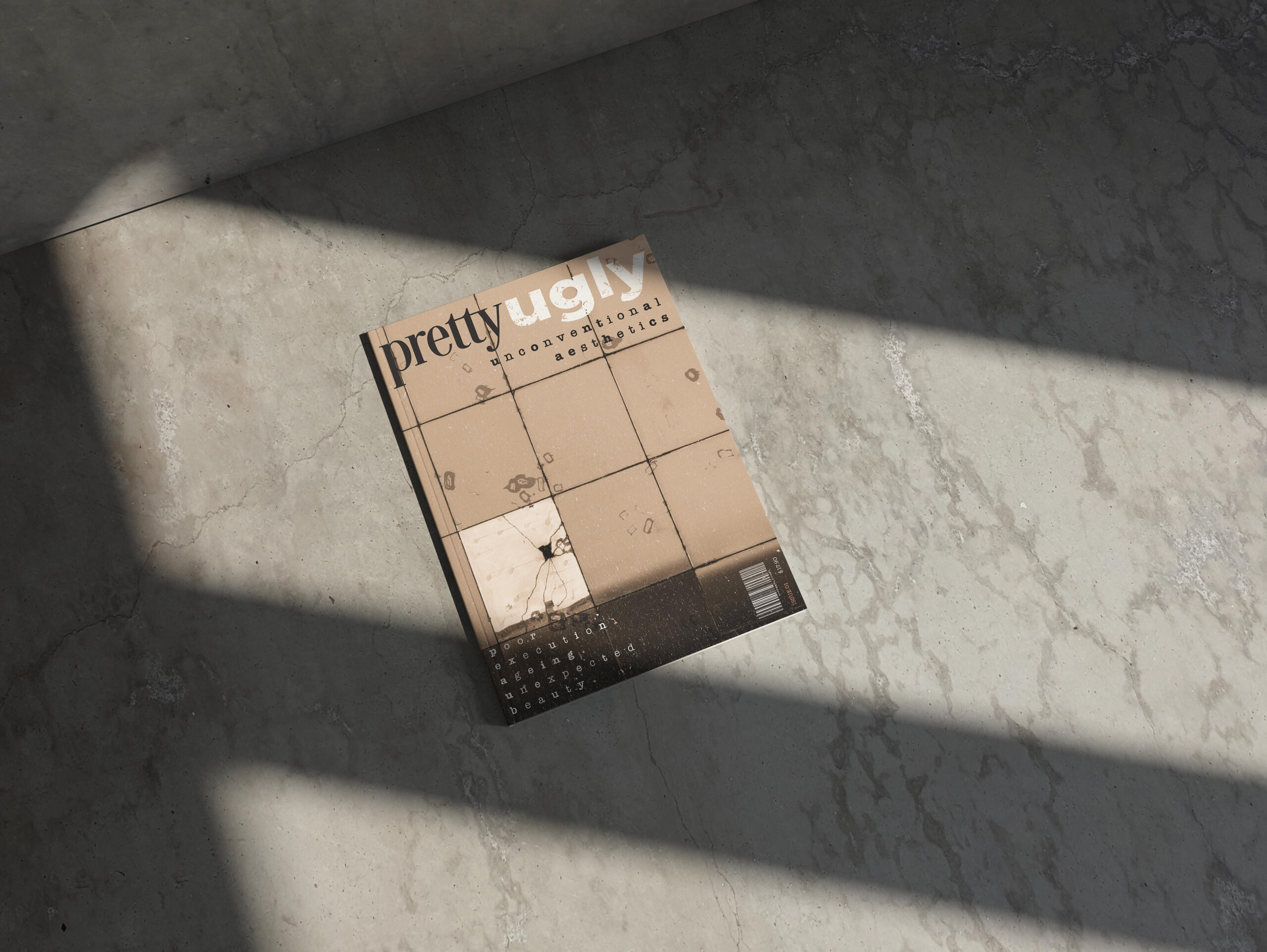
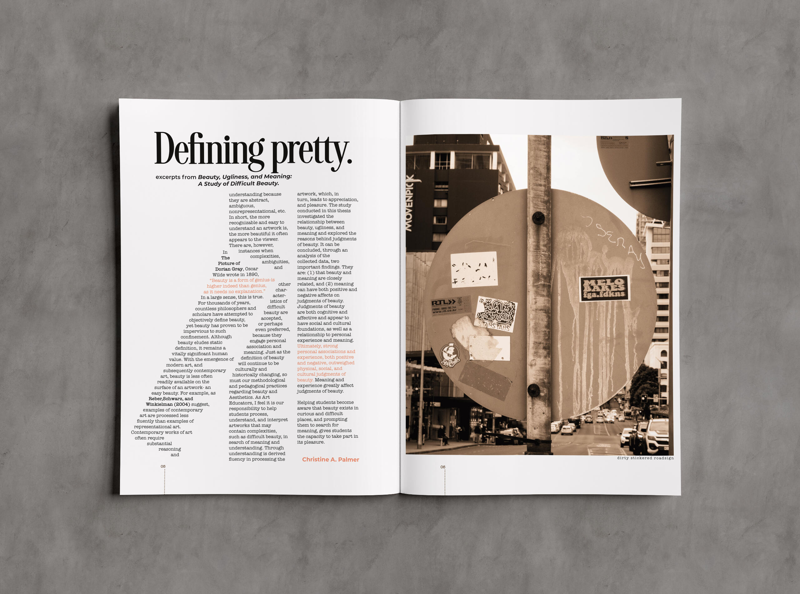
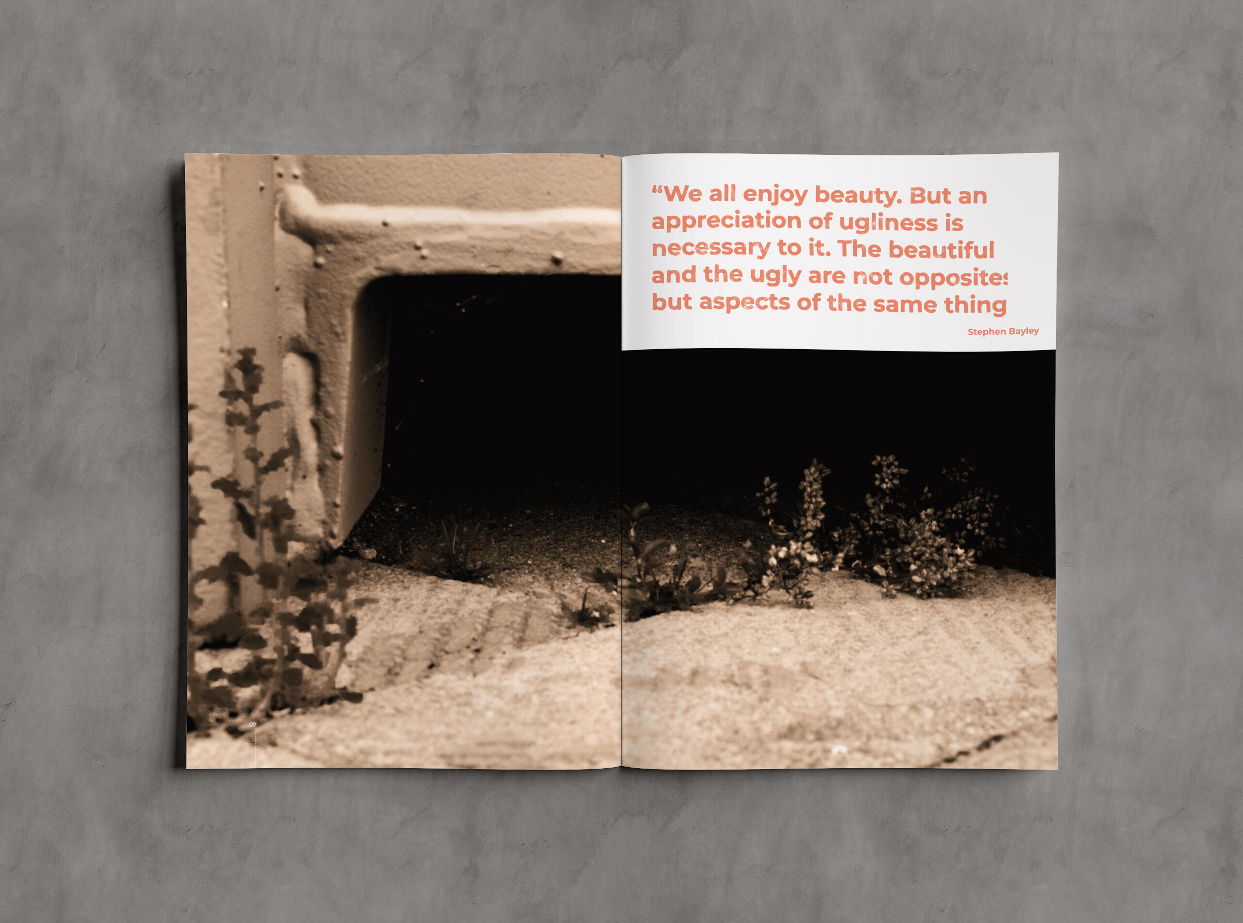
An experimental print publication exploring the tension between beauty and disgust. Built from personal imagery, sourced essays, and bold typography experimentation, it celebrates contradiction in visual culture.
Why this project matters
In a world where aesthetics are becoming increasingly polished and predictable, it’s easy to get stuck in one way of seeing things. Pretty Ugly Magazine challenges that by celebrating the raw, the imperfect, and the unconventional. It’s a space for young creatives in New Zealand and Australia to break free from traditional beauty standards and explore new visual perspectives.
What I did about it
I designed Pretty Ugly Magazine as a mix of photography collections, articles, and poster-sized spreadsthat readers can tear out and use for inspiration. The design pulls from grunge, brutalism, punk, and street art, using lo-fi methods to create something that feels raw and unpolished. Every decision—from typography to layout—reinforces the idea that beauty isn’t about perfection, but about perspective.
Why it works
Pretty Ugly Magazine doesn’t just talk about unconventional aesthetics, it embodies them. By blending thought-provoking content with an unrefined visual style, it encourages young aesthetes to break the mold and develop their own artistic voice. It’s not about rejecting beauty, but expanding the definition of it, proving that what’s considered “ugly” can be just as powerful and inspiring.

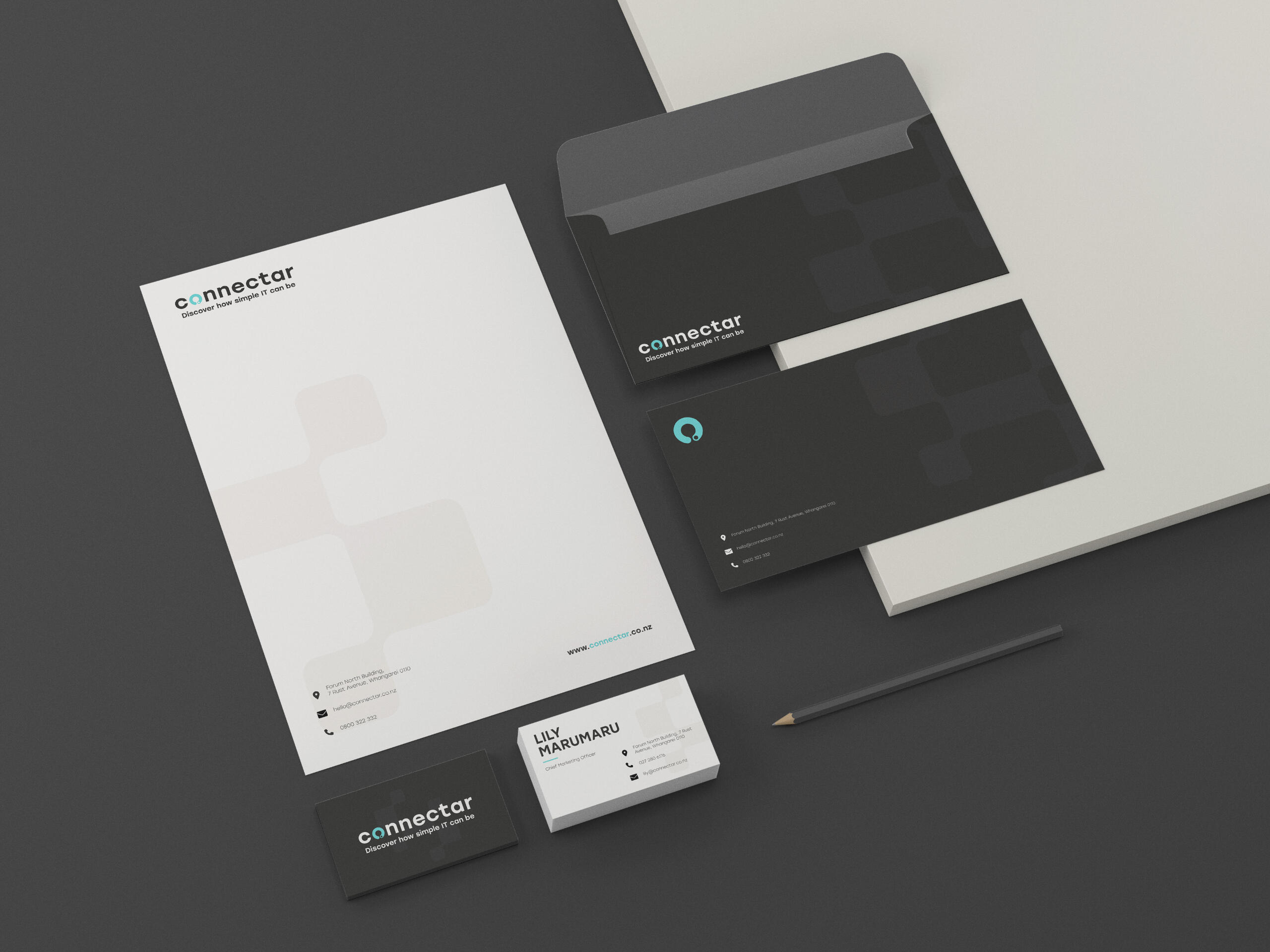
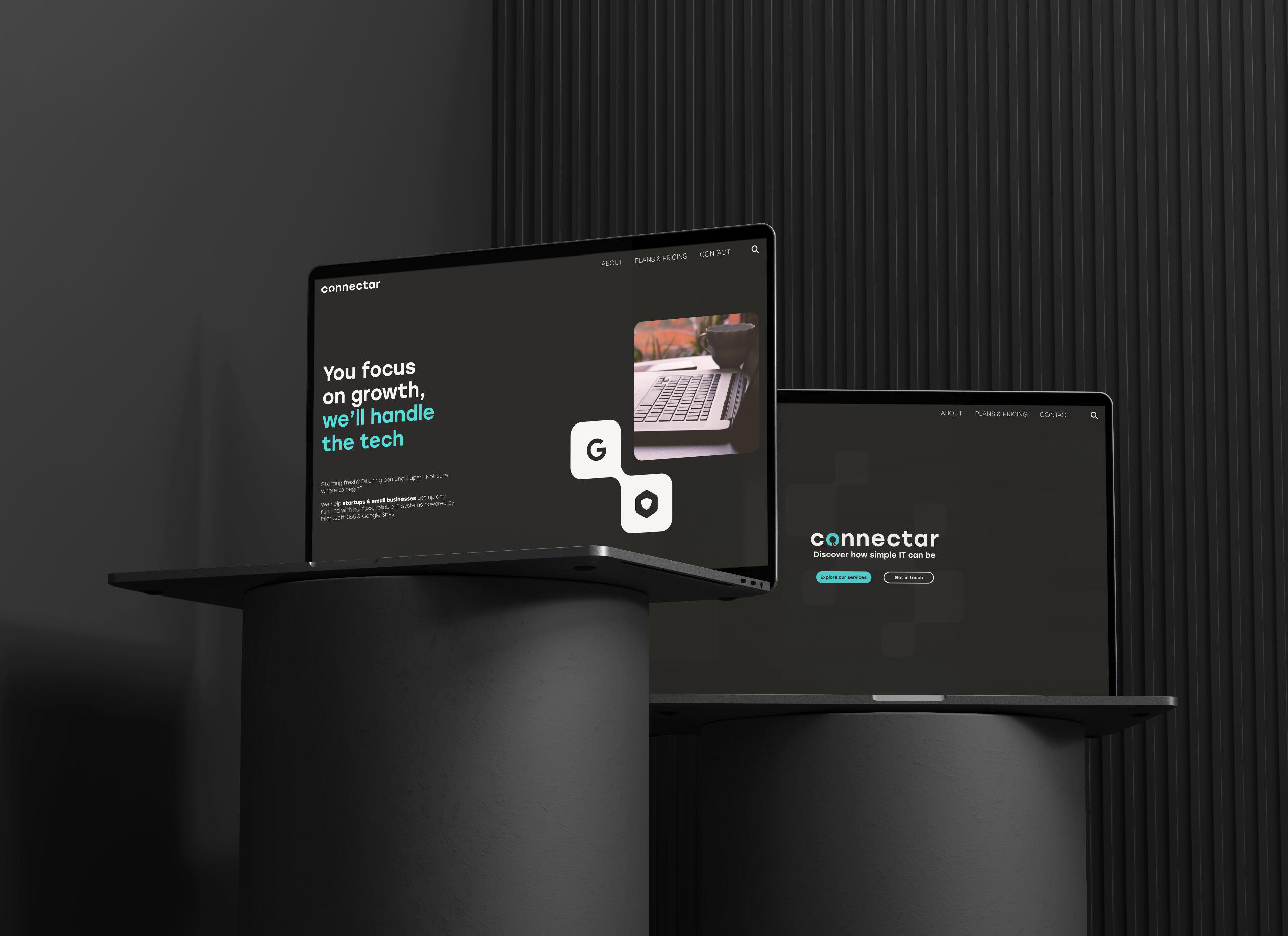
Brand identity and collateral for a startup-focused IT accelerator. Clean, minimalist, and reliable, designed to build trust with early-stage clients dealing with digital systems.

Why this project matters
Startups often have to look reasonably established before they are. For tech companies especially, clarity, trust, and consistency in branding can be the difference between opportunity and doubt for a client. Connectar supports these companies behind the scenes, so their identity had to reflect both knowledge and approachability.
What I did about it
I built a full brand identity froms cratch, starting with the mission and values: to empower businesses through reliable, minimalist, tech support. The tone needed to be direct, modern, and approachable. I delivered a visual identity system, logo package, colour palette, and tone of voice guidelines. Assets created included digital mockups, social content, and stationery.

Why it works
The brand hits the right tone; approachable, trustworthy, and quietly creative. It's adaptable enough for a broad clientbase, but specific enough to set Connectar apart in a saturated industry.
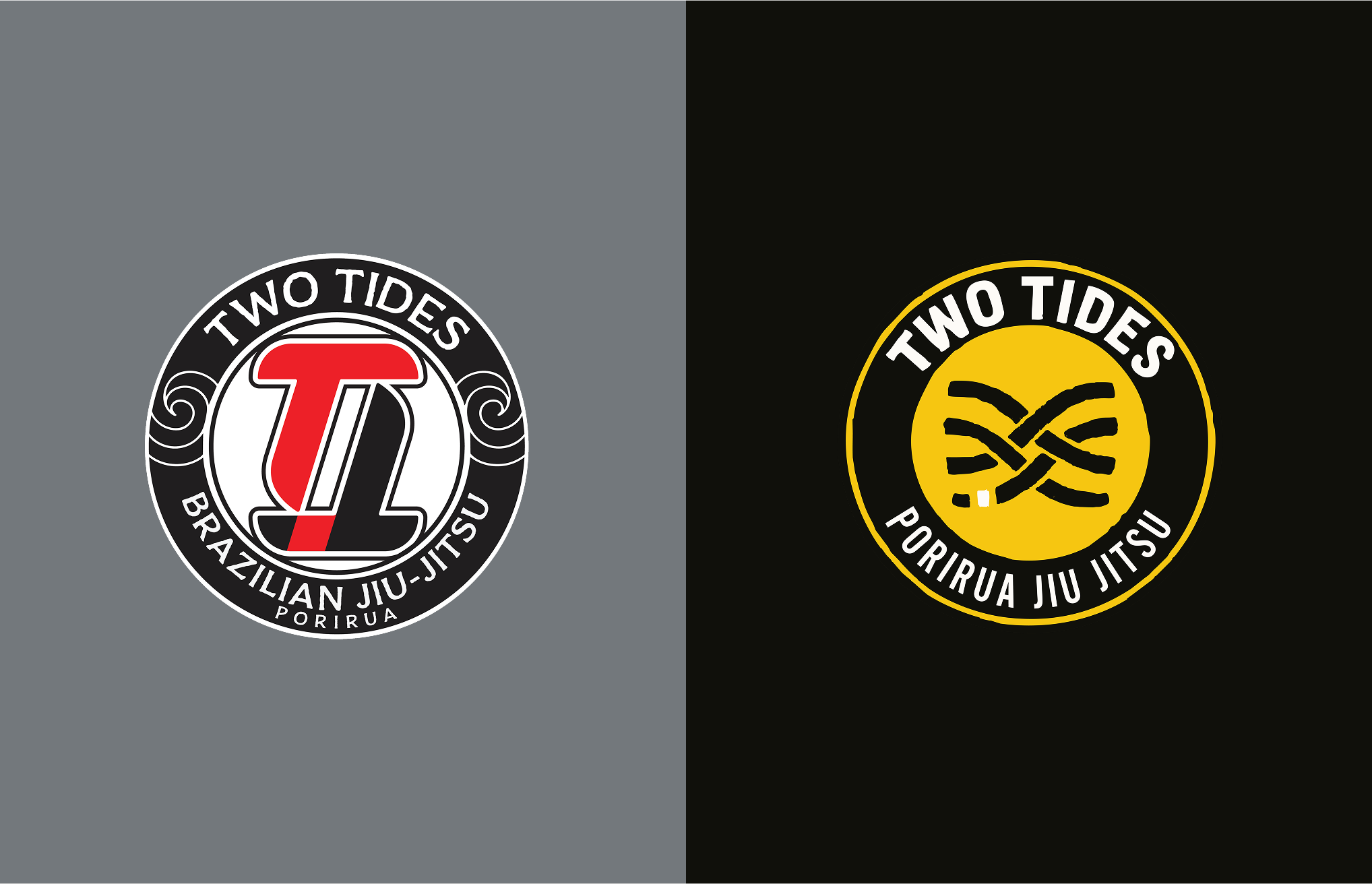
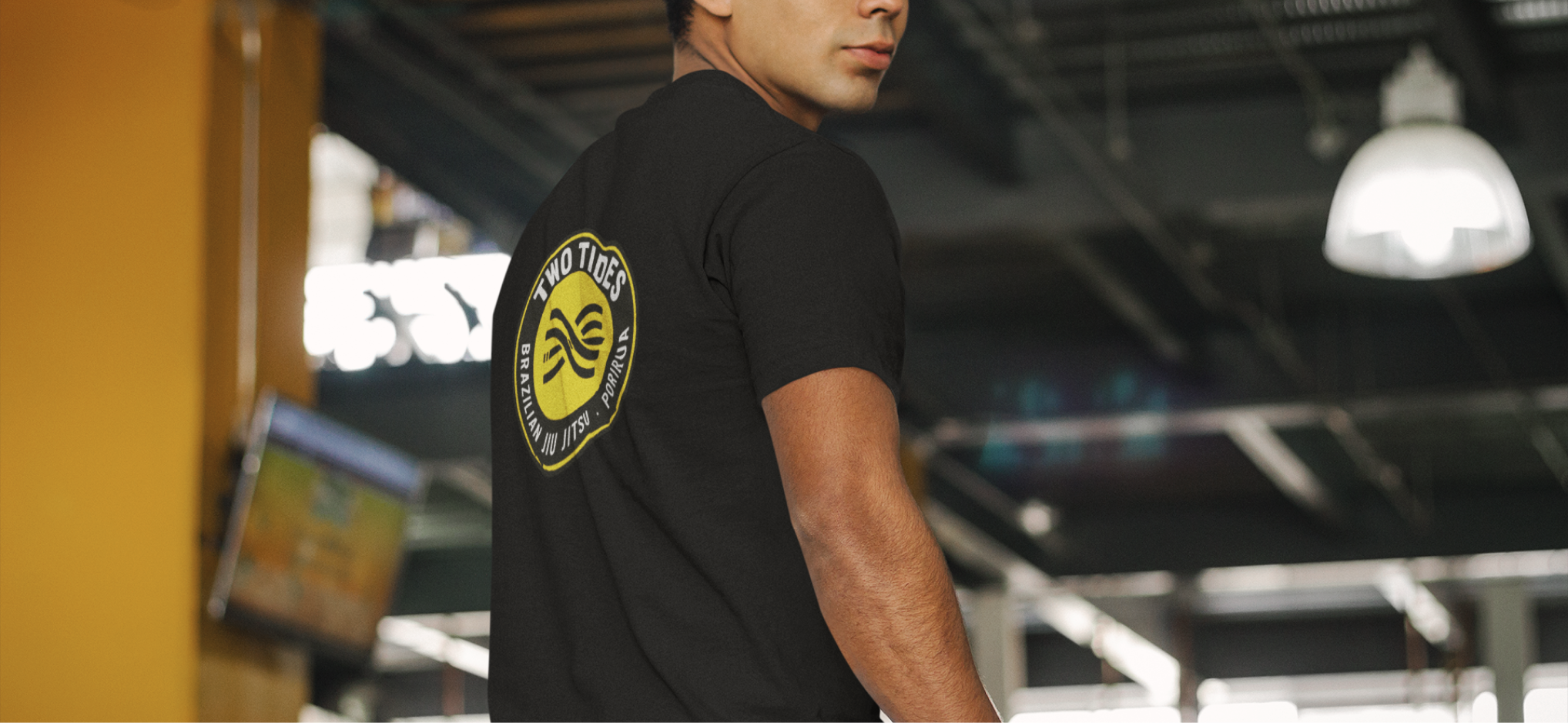
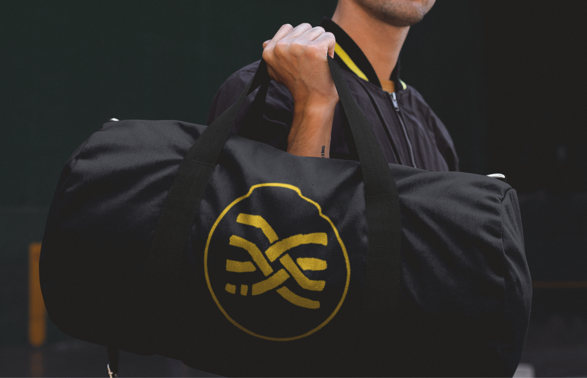
A respectful rebrand for a local Jiu Jitsu club in Porirua. What began as a logo vectorisation project grew into a complete identity refresh; new logo, colour palette, typography, and merchandise, honouring both the club's roots and its future.

Why this project matters
For a community-based club, identity isn't just about design standards or marketing, it's about respect, heritage, and belonging in that community. Two Tides Porirua Jiu Jitsu needed a visual refresh that honoured the meaning of their name while still feeling homely for existing members. By drawing inspiration from the tides of Porirua Harbour, the new identity connects to a place and people, offering a calmer, more stoic approach than the typical aggressive visual norms of martial arts branding.
What I did about it
I began by simplifying the club's existing brand down to its main values and influences. From there, I created a new logo using hand-drawn roughs, bold interlocking waves and curves that symbolise both the disciple of Jiu Jitsu and the flow of the two tides of Porirua Harbour. Alongside the symbol mark I developed a new colour pallete (shifting from red to yellow to reflect Wellington's identity while avoiding local gang connotations) and expanded the brand system into typography, imagery style, and merchandise. the outcome is a flexible identity that feels both rooted in place and future-proof.
Why it works
The new identity was warmly embraced by the club, even by those that were initally hesistant to a change in brand. Merchandise sold quickly and new social post designs gained more traction than before. By using the symbolism of Porirua's tides in the logo as such as focus and shifting towards a clamer, collected visual style, the identity of Two Tides stands out in a space often dominated by intimidating martial arts branding. As the club puts it themselves:
“New Look, Same Club. After a few years with our original logo, we’ve decided it’s time for a refresh. Our club has grown, evolved, and taken on a shape that reflects the people in it today — and we wanted a logo that represents that… This new design is simply a step forward, representing who we are now while honouring where we’ve come from.”
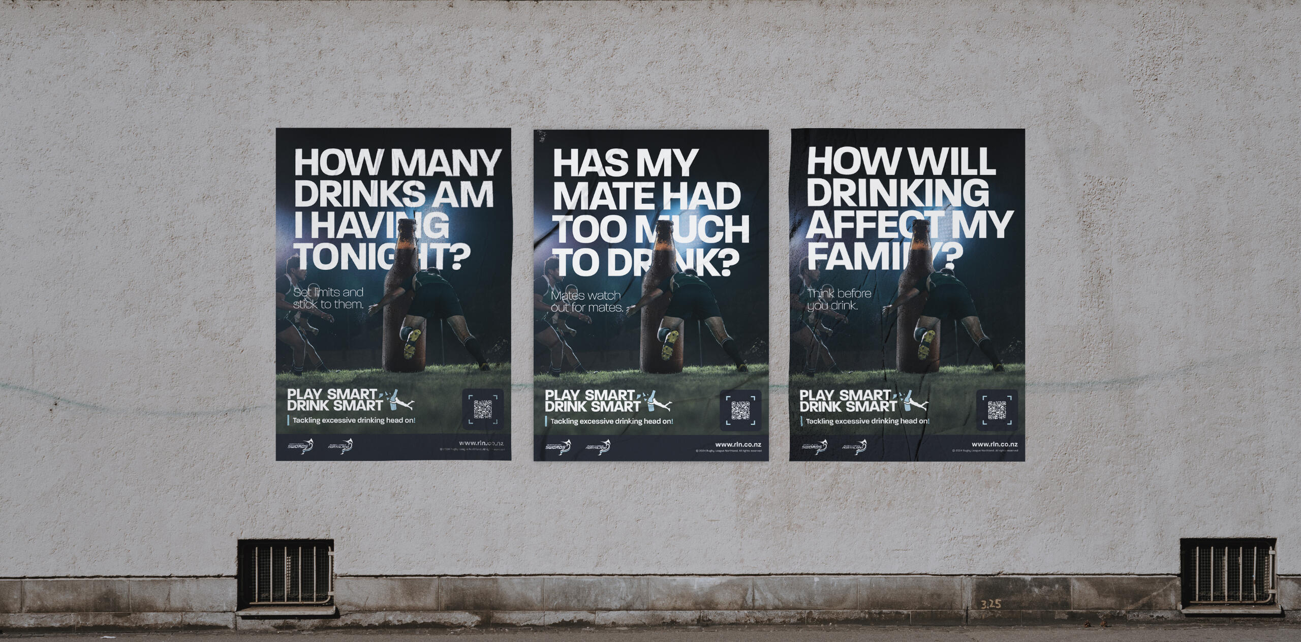
A rugby league led alcohol awareness campaign aimed at young adults. Through friendly visuals and honest language, it replaces scare tactics with empowerment and education.
Why this project matters
Alcohol and rugby league culture are tightly linked, but not always in a positive way. Rugby League Northland wanted to challenge unhealthy drinking habits in the community while keeping the social spirit of the game alive. Play Smart, Drink Smart encourages players and fans to enjoy rugby league responsibly without alcohol getting in the way of performance, safety, or community values.
What I did about it
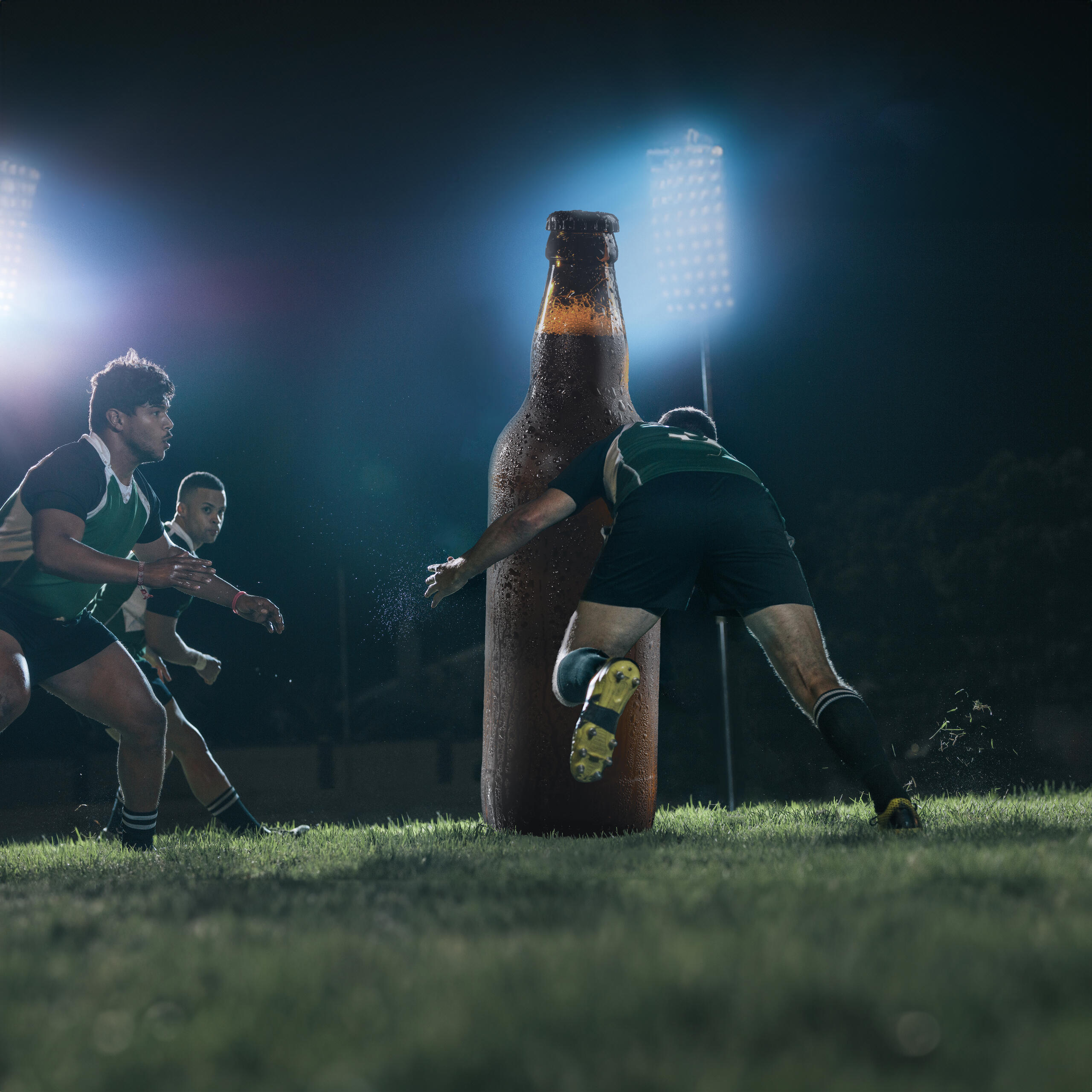
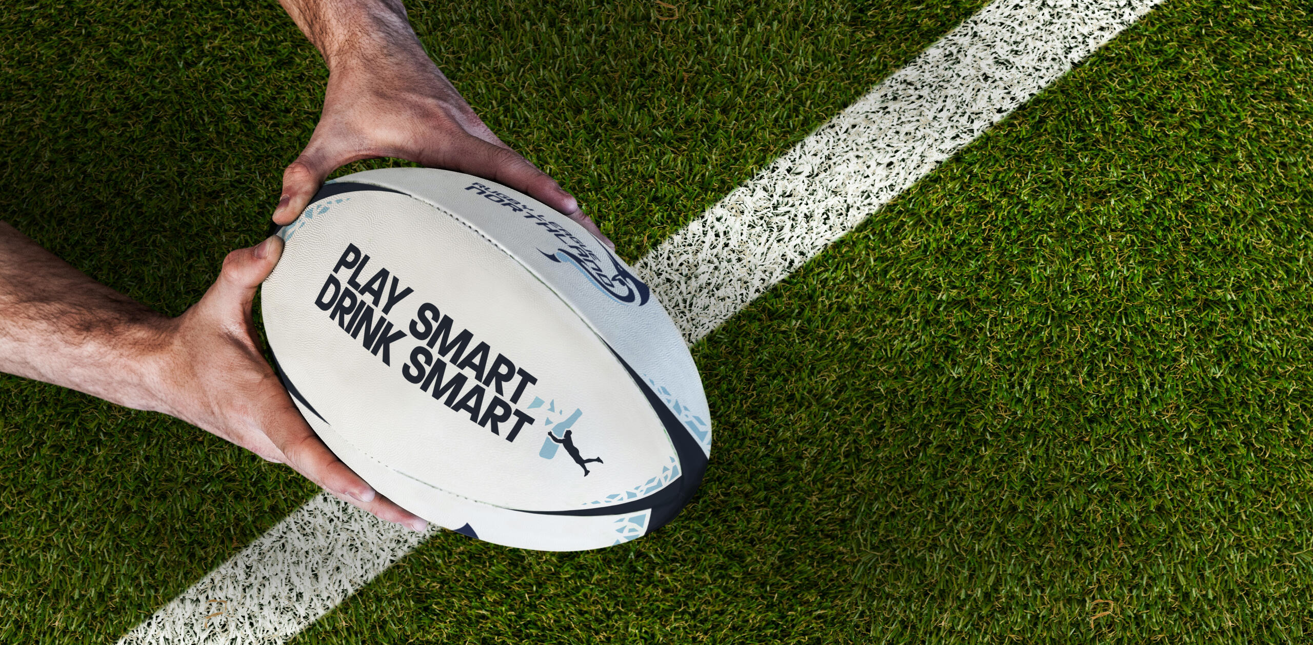
The campaign takes a on-the-nose, but supportive approach, using clear messages and a bold visual to reframe drinking as a choice rather than an expectation. A key part of this was the main hero image; a photoshopped, lighthearted take on a serious topic. By making a sort of caricature of the effects of alcohol, it caught attention while still making an important point. Alongside this, I developed graphics, posters, and social media content that highlight smart drinking habits without sounding preachy. By focusing on team values, well-being, and the balance of sport and health, the campaign stays relatable and practical.
Why it works
Play Smart, Drink Smart doesn’t shame drinking, but instead shifts the focus to playing at your best and looking out for your team. The hero image sets the tone, making the message approachable rather than heavy-handed, which resonated more with the target audience. By blending humor with a clear message, the campaign speaks to rugby players and fans in a way that feels natural, not forced, making responsible drinking a part of the game-day culture instead of a rule to rebel against.
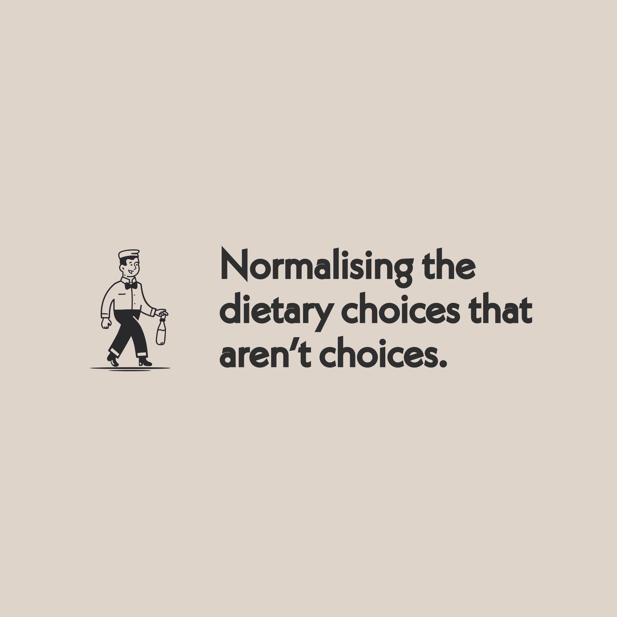
A fictional alt-milk brand that uses humor, nostalgia, and bold messaging to challenge outdated norms around dairy. Designed to flip the stigma and reposition plant-based as the new standard.
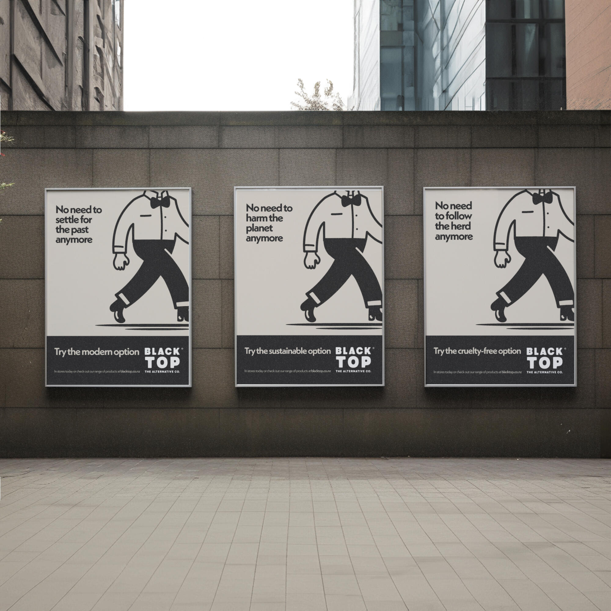
Why this project matters
Alternative food products still face stigma, making them less accessible and more expensive. Despite advances in food science, dairy remains the norm due to outdated habits and unfair pricing. Surcharges on plant-based options reinforce the idea that they are 'extra' rather than standard. BLACKTOP CO challenges this, positioning dairy as outdated instead of shaming its consumers.
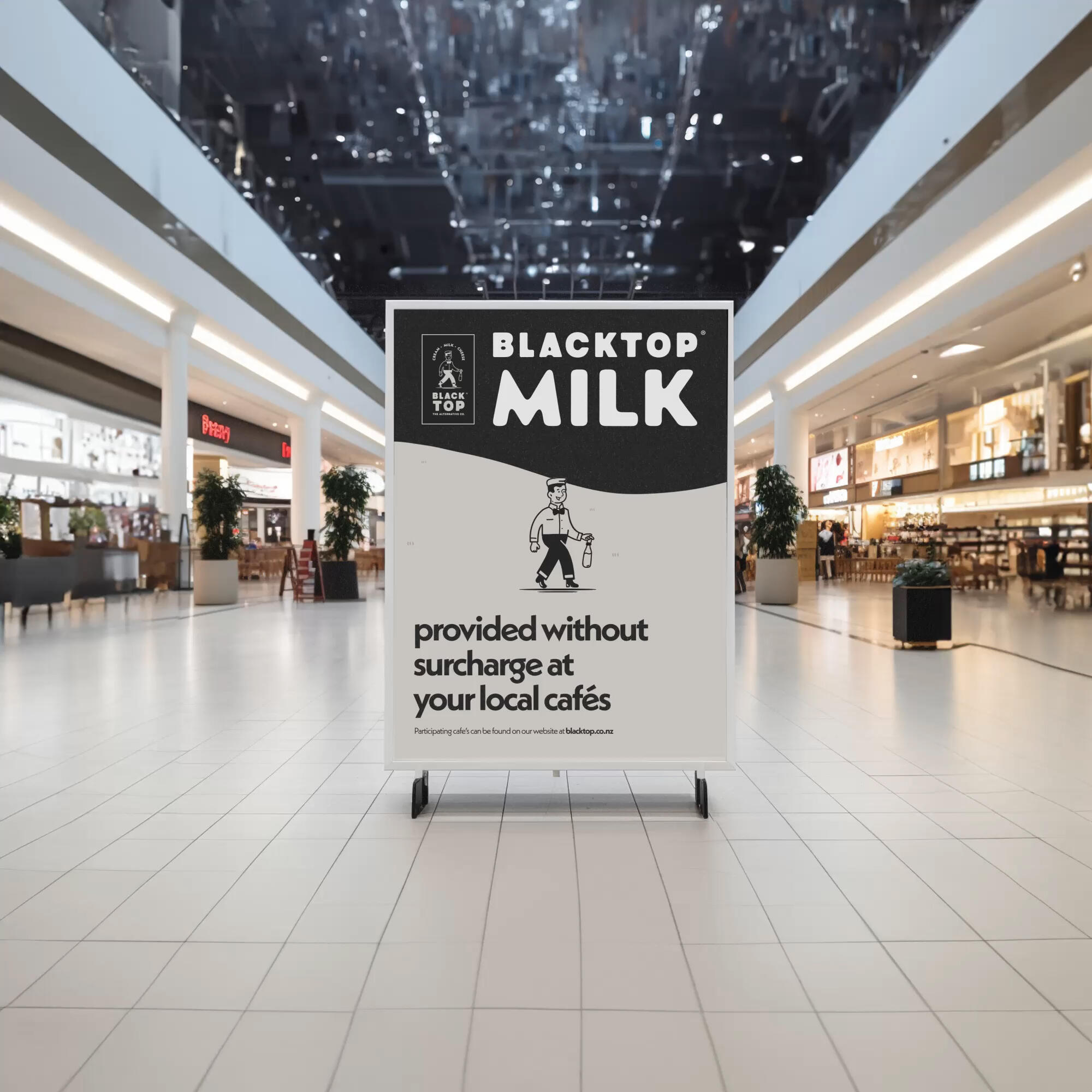
What I did about it
BLACKTOP CO uses humor and disruption to reframe the conversation. Our ‘reject copy’ flips the narrative, making dairy drinkers the unconventional choice. Inspired by 1930s-40s American dairy packaging, BLACKTOP CO’s branding is bold, nostalgic, and familiar, standing apart from the typical ‘clean and green’ plant-based aesthetic. Instead of sitting in the ‘alternative’ aisle, BLACKTOP CO competes directly with dairy, reinforcing its status as the new standard.
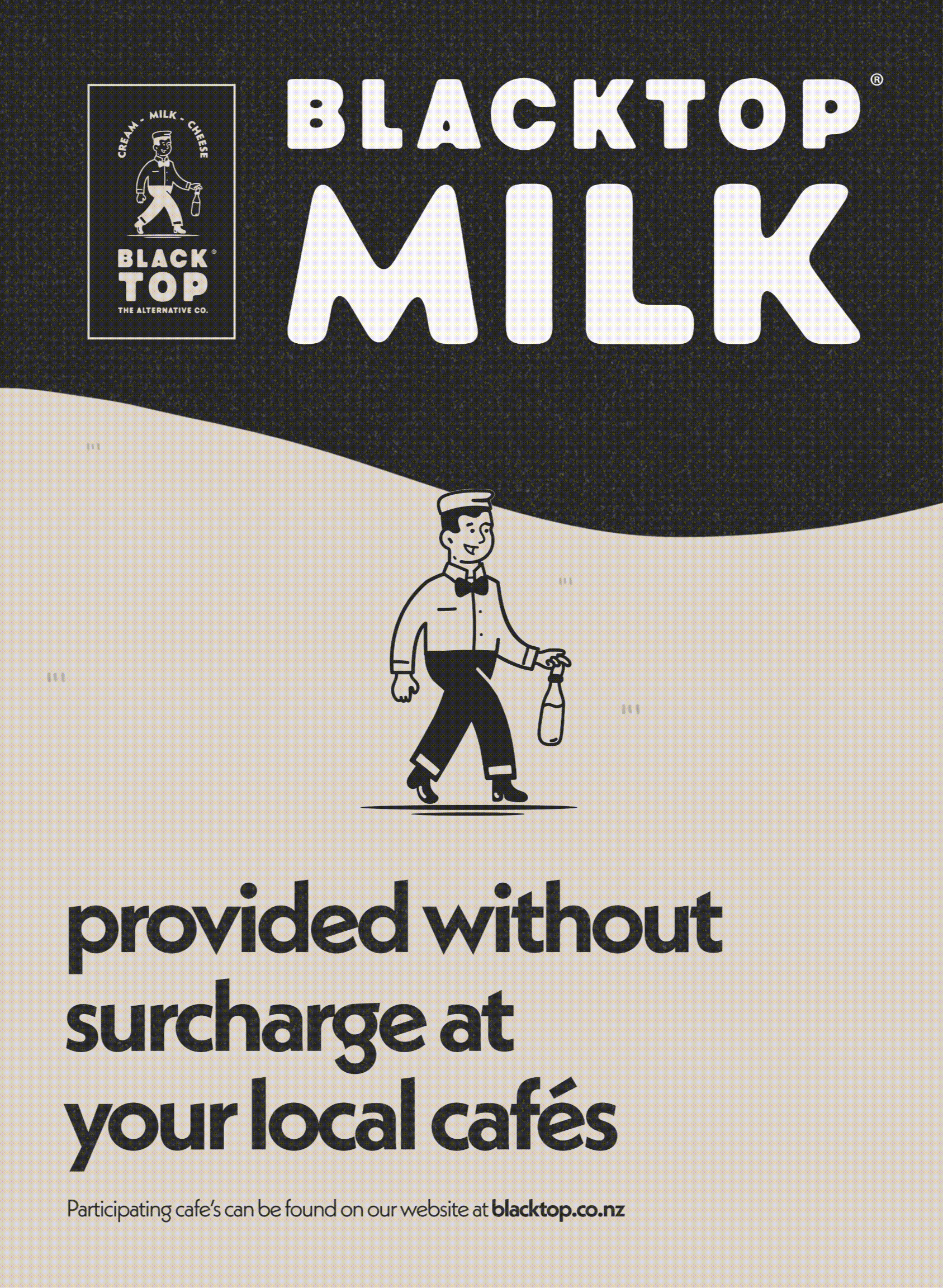
Why it works
BLACKTOP CO isn’t just another plant-based brand—it’s a market disruptor. By blending cultural nostalgia with bold messaging, it shifts the conversation from substitution to evolution, filling the gap between premium-priced alternatives and outdated norms.
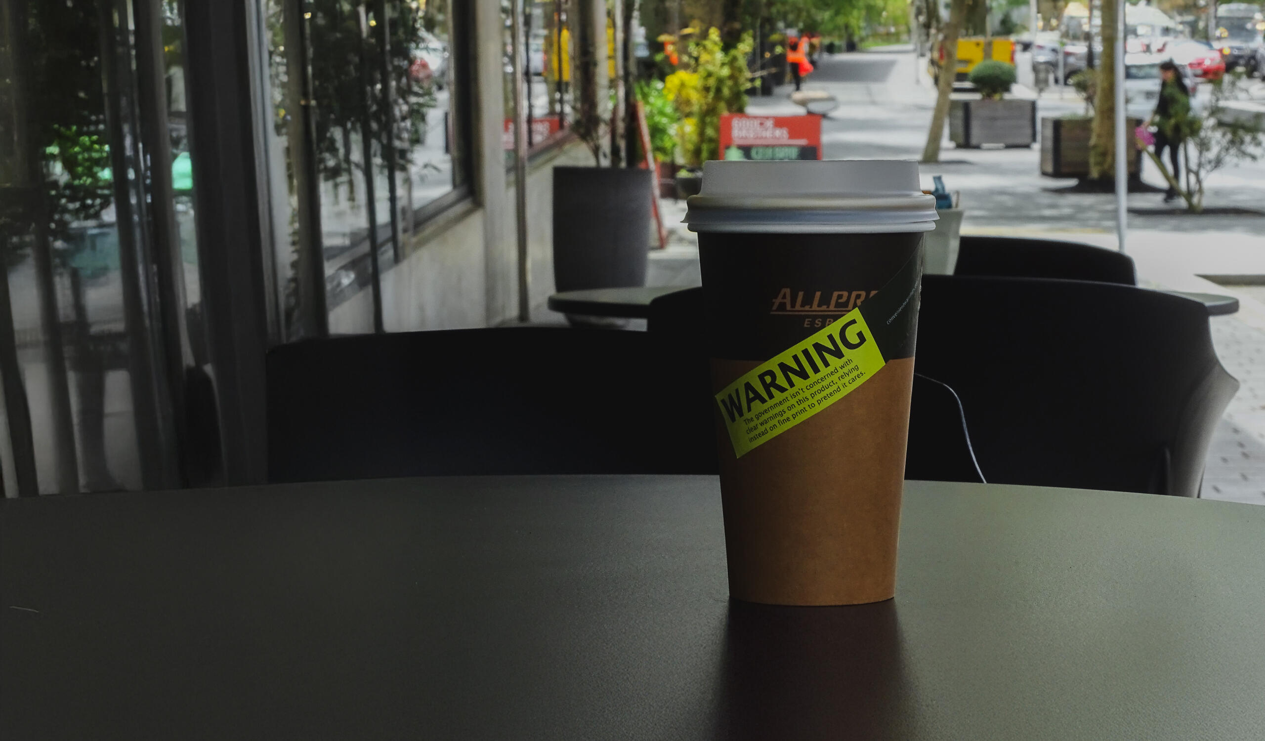
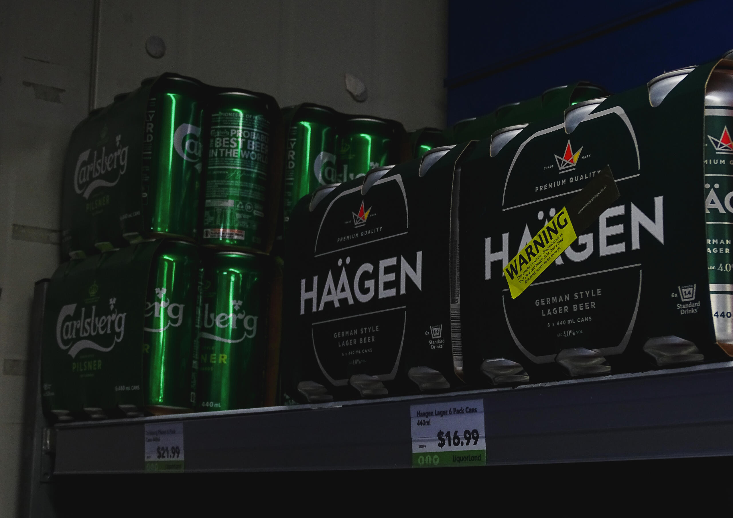
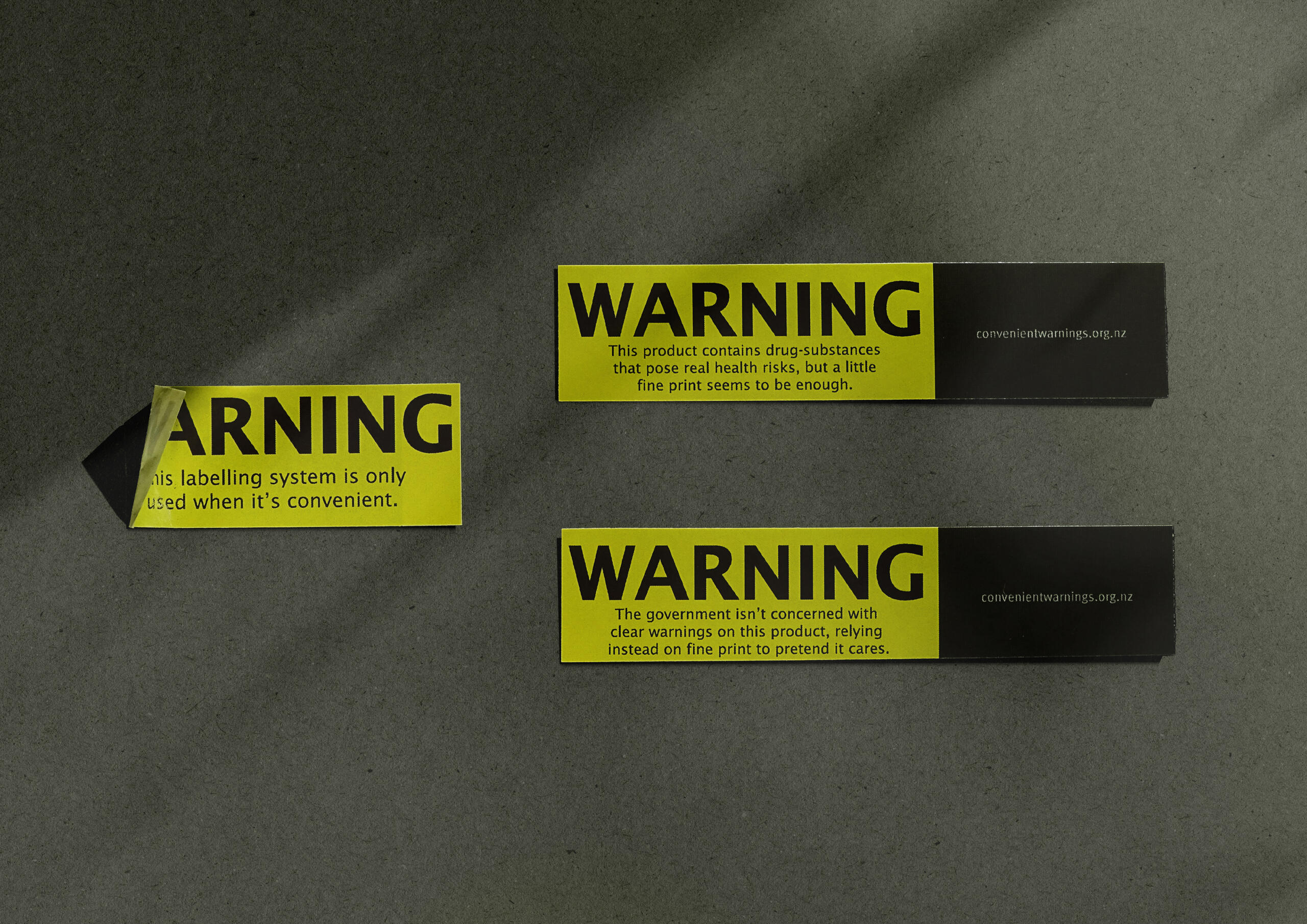
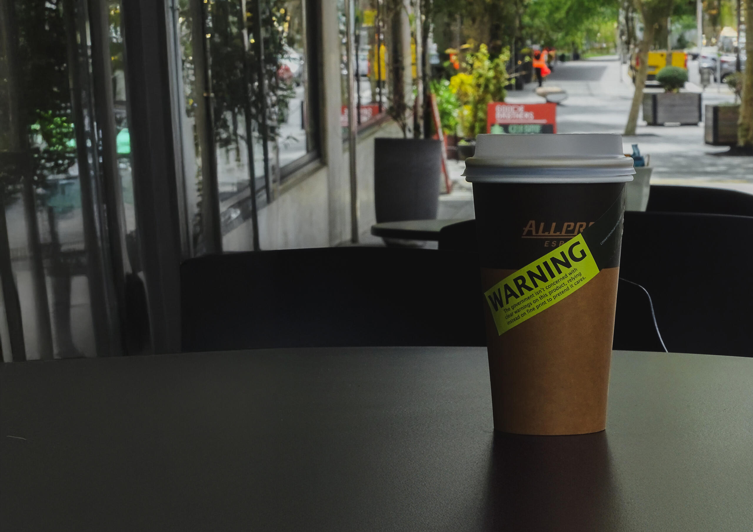
A guerrilla poster campaign that critiques selective government regulation. By mimicking tobacco warnings, it exposes the inconsistency in how other harmful products are treated.
Why this project matters
Health warnings in New Zealand aren’t exactly consistent. Cigarettes come covered in graphic warnings, while alcohol, energy drinks, and over-the-counter meds, despite their own risks, get off easy. This project points out that double standard and asks: if we’re serious about public health, why aren’t we treating all harmful products the same way?
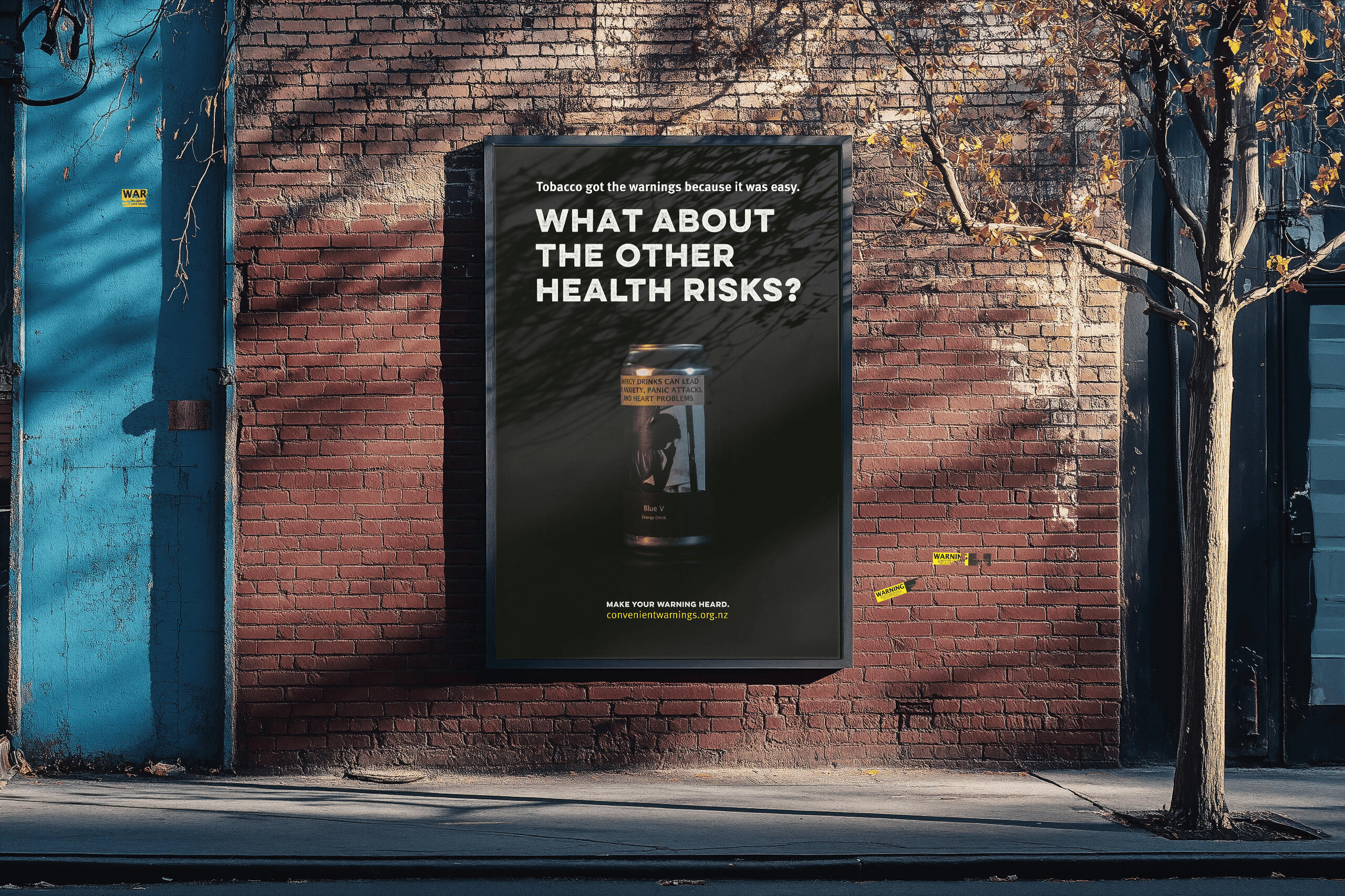
What I did about it
I took everyday products like beer bottles, energy drinks, and painkillers and redesigned their packaging with cigarette-style warnings. Using a bold cut-and-paste aesthetic inspired by Dadaism, I subverted what we expect to see on these products. The mix of packaging design and staged photography made them look unsettling and real, forcing at least a second glance.I designed a guerrilla campaign using posters, pull-off flyers, and stickers that mimic official safety warnings. These were placed in libraries, universities, and other public spaces. The materials critique how regulatory measures are inconsistently applied, challenging the viewer to think critically about product safety. The campaign is interactive, encouraging the public to place stickers where they see fit—empowering people to continue the conversation.
Why it works
Convenient Warnings makes the invisible visible. By applying intense health warnings across different products, it exposes the selective way risks are communicated. The visuals and regulatory language feel both familiar and jarring, making it hard to ignore the message. Instead of telling people what to think, the project challenges them to question why some dangers are highlighted while others are overlooked.
about sean
I'm Sean, a graphic designer with a love for clarity, meaning, and the occasional bit of creative chaos. With a degree in design and a background in both freelance and self-initiated work ( like somehowhappy.com ), I see design as a way to bring people closer to ideas, and to each other. Whether it's branding, visual storytelling, or marketing concepts, I'm in it to connect.
about what I do
I specialise in clean, full-personality design with structure behind it. Most of my work sits at the crossroads of branding, communication, and storytelling. My typical tools include:
- Branding systems (logos, guidelines, identity)
- Print and digital marketing (flyers, posters, decks)
- Advocacy & campaign design
- Light motion design and 3D work
- Social media strategy & content
- Visual copywriting & tone of voice
about working together
I’m currently working full-time at AUTSA as their graphic designer, so I’m not open to full-time roles right now. However, I’m happy to take on freelance projects when my freelance schedule and workload allow. If you have something interesting, send me a message!
✅ Available for freelance ❎ Open to full-time roles